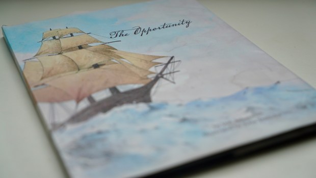
The Opportunity

This project has been a looooong one. I first accepted the job to layout this children’s book in the spring of 2017. Now the files have been completed, the Kickstarter has been funded (exceeding the original goal of $6,000 dollars by raising over $32,000), and the book is being printed and shipped. It turned out lovely. I’m very excited to receive my copy!

Continue reading

Stake Schedule Flyer

This is one of my favorite type of projects… taking a chaotic amount of information and making it beautiful, legible, scannable, and easy to use. The original document I was given can be seen below. I don’t show this because it’s a terrible example, but because it’s a very ordinary example. This is what you get by default when you place a lot of text into a Microsoft program, every single time. A program alone is not capable of making this right. That takes a designer.

Continue reading

International Bird Rescue -Photo edit

As part of a project I took on for the International Bird Rescue team, I did a special Photoshop edit of the photo below. As you can see, the original is kind of muddy. The lack of color in the foreground of the picture and the busy detail of the ship in the background cause the two grounds to compete. To relieve this competition I took the color out of the background and toned down the intensity of the ship’s lights shining through the fog. As you can see, this defines the bird more prominently as the main subject of the photo and makes the picture look more artistic and compelling.

Continue reading

Timpanogos Temple Paper Cut

For my birthday everybody in my family pitched in to get me a Silhouette. (Oh the benefits of having 7 siblings, muahahahah.) This gift has inspired a whole host of new crafts, and I usually don’t post my exploits into the craft world to my portfolio, but this has elements of design involved. I also made the floating acrylic frame myself. The cut file for the paper originated in Illustrator. Once cut, the pieces were assembled and glued by hand.

Continue reading

Cole Wedding Invitation

This was my biggest rush job of the summer. Cole’s Mom contacted me late one night, to say her son was getting married, and the only weekend both families could squeeze in a wedding before Cole’s school commenced was in 3 weeks! Luckily the bride knew exactly what she wanted. I churned this one out in about 2 hours. Congratulations Cole and Emily!

Yo Apparel

I had an excellent time working on this clothing logo with a new client. Her brand encompasses feminine street clothing heavily influenced by Japan. When she first said that I wasn’t sure what it meant. It took a lot of solid communication for me to build a sense of her brand in my mind before I could start work. I’m particularly proud of how quickly we nailed this sucker down, since my fist impression of what she meant was rather wrong. When she said “feminine street clothing” I thought she meant casual clothing that’s feminine. What she actually meant was urban style clothing for women. She was looking for Asian minimalism that was funky and bold.. One of the trickiest parts of designing a brand is properly interpreting a client’s description of the company and what they make. Words can mean such different things to so many people. I think I did an A+ job listening to her and internalizing the image she wanted to personify. She came away happy quickly, which I call a job well done.


Continue reading

Joseph Ponders in the Pit

This is not a typical project for me to blog about. Lately I’ve been rather captivated by paper cutting. I created this piece for the 11th International Art Competition of the Church of Jesus Christ of Latter-day Saints. I’ve always wanted to submit something for the competition, and the theme inspired this tunnel book. It’s done well in the competition so far… I made it through the first round of jurying. I created the general design in Illustrator and then cut out the sheets by hand with an Exacto knife. I also built the box. Here is the description I submitted with the piece:

“Thousands of years ago, Joseph, son of Jacob, began dreaming unusual dreams. He dreamed his brother’s sheaves of wheat stood up and bowed to his. He dreamed that the sun, moon, and 11 stars (representing his brothers and parents) made obeisance to him. With visions like these, the future must have looked pretty bright! And then young Joseph found himself trapped in a pit, his own brothers responsible for his capture, some even hoping to kill him. This betrayal must have been especially bitter and confusing considering the visions God had given him of his own future glory. How did Joseph keep believing in God’s promises when his life was headed in the opposite direction? Perhaps it is no coincidence that wheat, stars, the sun, and the moon might have actually been visible from his place in the pit. Perhaps this was one of God’s tender mercies, helping Joseph know that his promised blessings could not be taken by his brothers. In any case, we know for certain that Joseph kept believing. And if he could find faith in a brilliant future from the depths of a pit, we can too.
The first 10 pages of the tunnel book form the walls of Joseph’s pit and represent the 10 brothers who imprisoned him. The sun, moon, and eleven stars in the background represent Joseph’s father, mother, and brothers. Three of the stars are slightly bigger than the rest, representing the privileges later earned by Judah, Benjamin, and Levi to father Jesus Christ, build a temple, and hold the priesthood. “